Scary walk video edit

In class this week we were asked to take a 40 second video clip of someone walking through the woods and using editing software and free sound effects we were to turn it into a 15-20 second video which brings across a sense of fear.

I used Premier pro to edit the video and add a black and white filter and i used Freesound.org and soundbible.com for all my sound effects.

here is the link to my video- https://www.youtube.com/watch?v=G0M0SJAmDho&feature=youtu.be

I found this task quite fun as it let me play around with layering a few different sounds on top of one another and using transitions to add to the fear effect. overall I think I did pretty well on this task using the small amount of knowledge i have on video editing.

Sketches 6 – Propaganda 

This weeks topic was Propaganda.  I found this weeks topic very challenging as this is a whole new thing for me. I am familiar with the concept of propaganda say during WWII but have never really delved into it.

The dictionary definition of Propaganda is…

  1. information, especially of a biased or misleading nature, used to promote a political cause or point of view

This first drawing is off a mock up flag/poster I chose to make it look ruff and old as this is the feeling I get from propounds posters. I used bold colours with stars and strips as these are assist aged with politics and the American flag I also got the strips idea from another Japanese looking flag I found while doing research. 

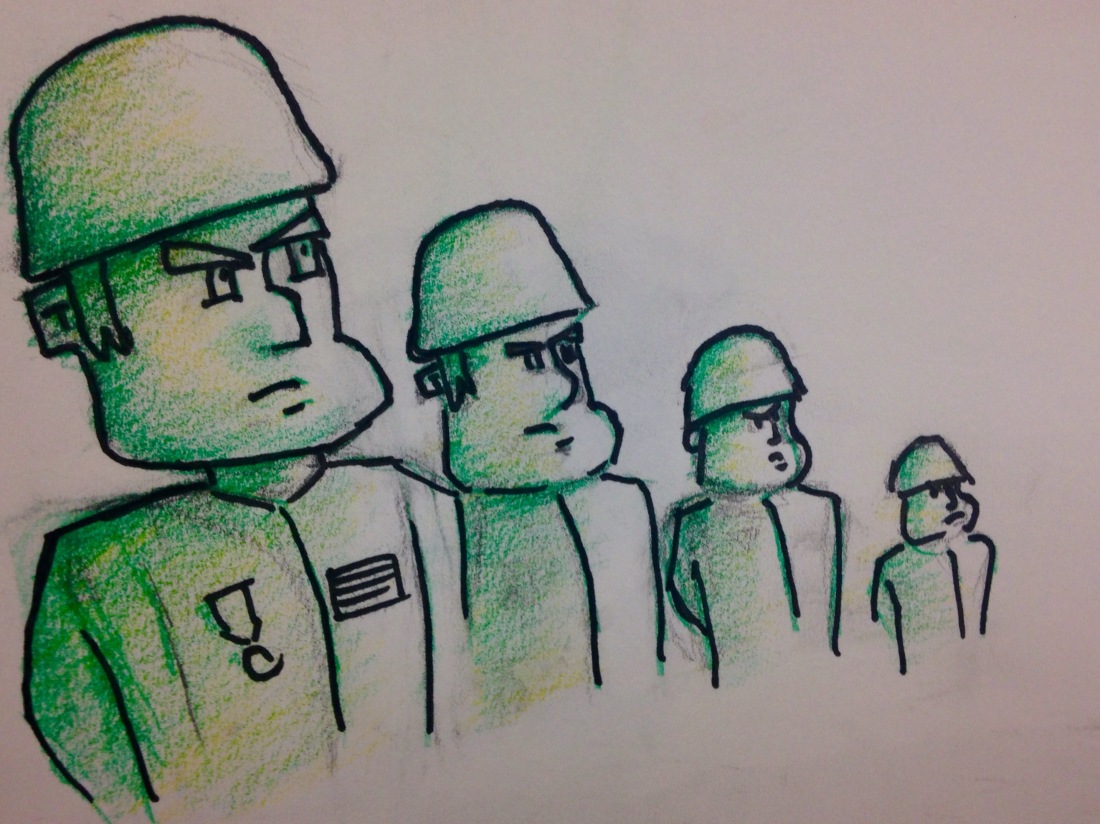
This next sketch was done using pen to outline the soldiers and pencil to add shading and colour. I thought this was an apporprated thing to draw as I associate propoganda with the war times which is why I have decided to draw solider all in a line like they are taking orders. 

This drawing is ment to follow the same idea of a traditional image seen in a propaganda poster. I went with bold colours to make it stand out and also apcolours that are traditionally found in propaganda posters. I thought this is a good image to draw as it is of 2 fists in the air and it brings across a striking and powerful message which is the intention oF propaganda.
  

My next sketch is a pencil drawing of an image I seen while researching this topic I thought this was a good thing to draw as it brings across a powerful look about it and the man pointing in the poster looks very intimadting. I also thought it as good to draw As I find it an appealing piece to look at.

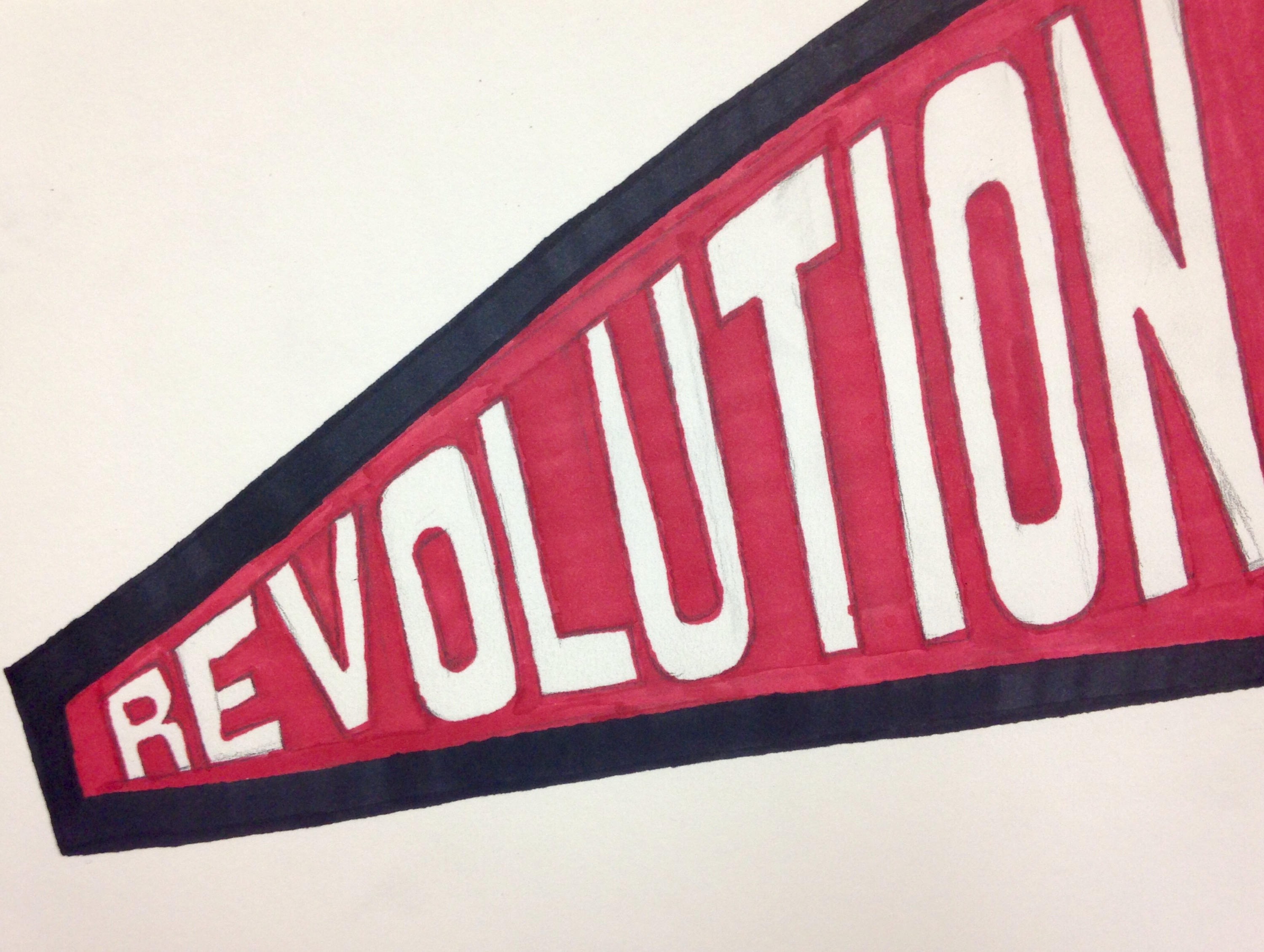
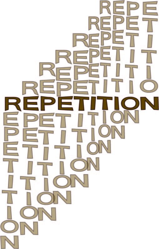
What I have tried to do here is make something with a striking message while still looking simple to make sure it’s message is understood by many people. This is why I went with bold colours such as red and black to make it stand out against the White of the background and the  lettering. I positioned the text Revolution like that getting small to big to simulate the idea of it being shouted to the person reading it.

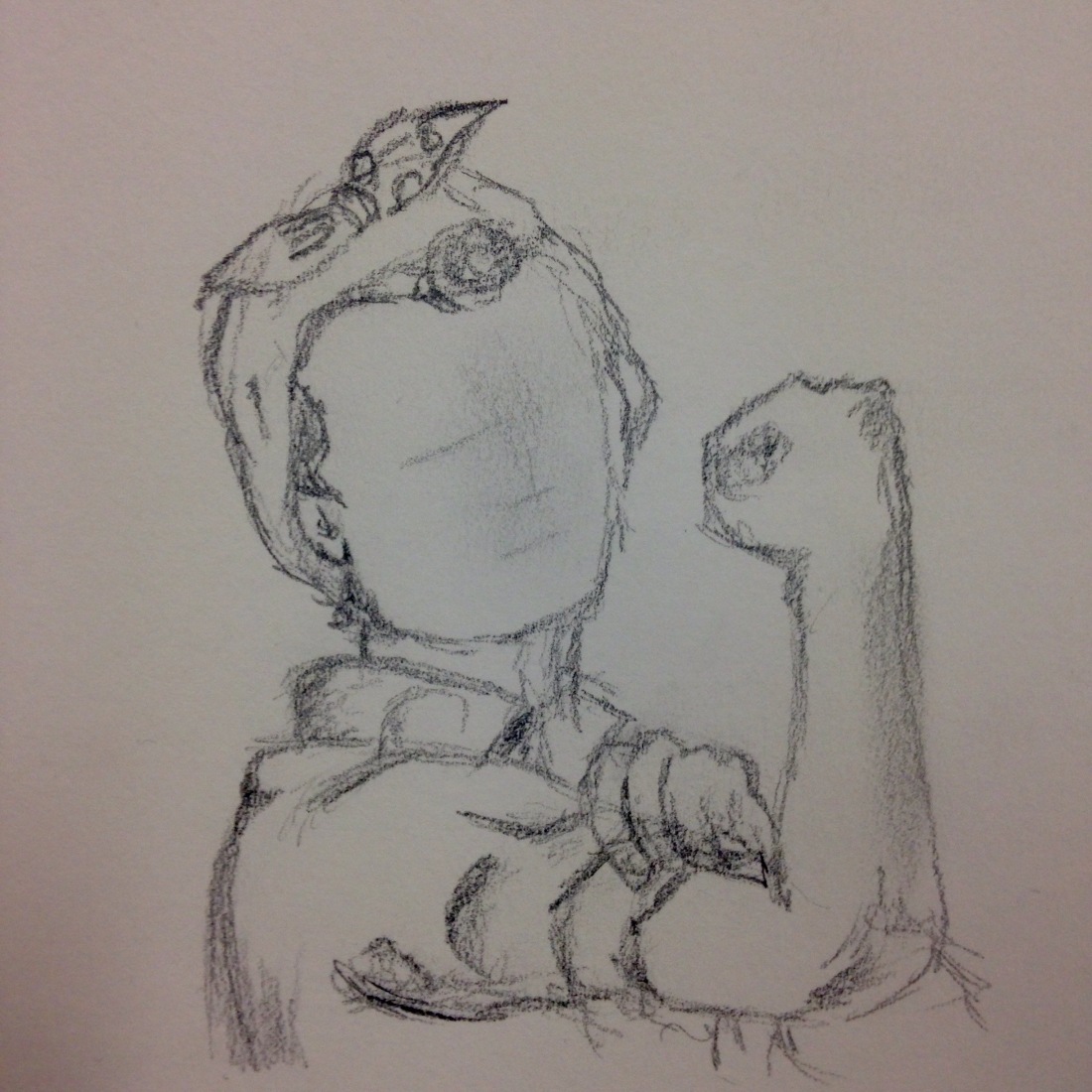
And finally my last sketch is of an image I found while researching e topic. It is of the women in the “we can do it” poster. i deduced to draw the women becuase she is the main part of the poster and it brings across a very powerful image of women during the war times. I also decided to draw it as I thought the imagery of the poster as a whole was very striking and appealing.

Overall I found this weeks topic quite challenging as “propaganda” is a lesser known topic to me in comparisons to the others, in the end thought I feel like I came up with a good range of imagery to show what I have found this week for this topic.

Sketches 5- Movement 

Last weeks topic was “Movement”.

The dictionary definition of movement is…

  1. The act or an instance of moving; a change in place or position.
  2. A series of actions and events taking place over a period of time and working to foster a principle or policy.
  3. The suggestion or illusion of motion in a painting, sculpture, or design

Below are a few sketches/ideas I have done for movement this week.

My first sketch is off a back packer on a mountain top. The reason I drew him was they have a tendency to move about from location to location and never really stay in the same place for long.
  My next idea was I was thinking about different vehicles and modes of transport and how we move about ourselves. I decided to go with a rocket as they have moved humans around the furthest distance in comparison to other modes of transport I also wanted to do a rocket as I think it would be more appealing to draw.


  The next thing I drew is a cartoon character doing a walk cycle. I thought this was an appropriate thing to draw as it ties into my animation module and how we have to think about the movement of certain bipeds. I find it interesting to see just how complex a simple movement looks when it is broken down.
  Next I did a sketch in blue pencil of a small bird. The reason I chose to do this is that I find the wing movement of a bird very fascinating as it not only looks appealing and almost mesmerising but it serves a very important purpose in the function of the birds flight and how it moves around in the air.

  My next sketch is probably my favourite one I did for this topic. I have followed on from the idea of the walk cycle above and made the character throw a ball but instead of having them displayed next to each other I decided to draw them on top of each other in different colours to show off exactly how the motion has turned out from the same space.

My final sketch is of a ballerina. I decided to draw this because I feel like ballerinas move in such an elegant and passionate way when they dance and I feel like I could do an idea around this showing the flow and rhythm of the movements.

walking dog

And finally while researching the topic online I came across an interesting painting known as  “The walking dog” by Giacomo Balla which was part of his Futuristic movement. I want to include this painting as part of my research into the movement topic as it shows the idea of overlapping the movements from the dog, the human and the lead in the painting and I find it looks really interesting and eye catching and ties in very well to the movement topic for last week.

I found this weeks topic very interesting as I like the idea of showing movement through a still image. Although it was quite challenging to show that I feel like I did an acceptable job in showing it through my different ideas.

Kickstarter- logo ideas

here are a few sketches/ ideas for potential logos as you can see I have called my product “Galaxy Gumbo”. I chose this becuase I wanted a quirky cute name which would appeal to young children also my figures are ment to be like aliens so the name fits them as well. 

   
For these logos I went with a cute chunky look which looks child friendly and simple.
 For these logos I went for a retro sci-fi look which fits the alien figures.

  
Finally my last ideas are tying the cute and sci-fi look together I wanted to turn the “O” in the Gumbo part into a cute character so that the logo is more remberable and attracts young children.
When I finally chose my logo I will take it into photoshop and work on it adding bright colours and making it look more eye catching.

Kickstarter- Examples of products i like / Research

Here below are a few other examples that are similar to my project. I have taken inspiration from them but have made sure not to totally copy the idea as I want to make mine euniqe and new.

Dunny

Dunny by kidrobot What I like about these products as that they all follow the same basic shape which is like a rabbit but all have there own unique designs. What I also like about these is the element of suprise you get from them as they are also mystery blind figures and they have a range of rarity for each one. This product is for ages 16 and above as it is more of an adult toy collection due to smaller parts and also the nature of the art style on them isn’t very child friendly.

tadcarpenter_dunny1 kidrobot-dunny-series-2012-hqtr kidrobot-dunny-series-5-2

Minecraft figures

Minecraft mystery figures What I like about these is the bright colours and pixely design they have which makes them really eye catching and appealing to children. The one thing I dislike about this product is the actual size of the product. It’s far to small for very young children as it can act as a choking hazard.

minecraft minecraft-minecraft-netherrack-series-3-mini-figure-mystery-box-mattel-toys-10

GoGo Crazy bones.

i really like the odd looking design of these figures, they also come in a wide range of bright and attractive colours. What i like about these figures as that they are very simple as well like they all come in one piece and have no extra parts which is what i want to do with my figures as well. i also like the fact that they look very child friendly as in the designs are aimed at children and aren’t as complex as more maturer collectors figures like the dunnys above. The thing i don’t like about this product is the size of them as they are too small for my target market of young children so this product is more suitable for 7+.

Charactersobones gogos gogos-mostwanted-1

What i also really like about GoGos is the fact they have a massive range of figures in each series. in each series there are 80 different figures and 5 very rare ones they have 7 series in total and also a few side series which are special edition.

Moshi Monsters

A product that is very simular to the GoGos are the moshi monsters. these are more taylored towards younger children becuase of there cute designs. alothough they are very small the original series the same company has come out with larger figures and a whole range of other products such as plushies which are more appropriate for younger children. What i really like about Moshi Monsters is that they have a large series and also expanded into other products with the same characters which is what i could do with my project as a stretch goal in the future.

maxresdefault moshi-monsters-soft-toys-78150 Srs_8

Overall you can see I have gone figures that have a bright colour palette and a unique quirky shapes. I want my own figures to follow this sort of style while at the same time still being unique and also making sure it is safe for younger children to play with and not be a choking hazard so my product would be a lot bigger and made with a safe plastic.

Kickstarter- Further development (change of plan-ish)

As I stated previously about doing a mystery blind box figures I have decided to change this due to further research. I want to make sure my product is appealing to younger children. at first I thought doing a random box idea would add to the appeal of them i feel like it would be more suitable for slightly older children about 7+ and i want my toy series to be aimed at younger children than that. I felt the need to change it from a random blind box to just a toy series where you would know which one you are buying instead because i feel like younger children would rather choose which one they want and I want to avoid the younger child getting upset if they get a repeat. Also it would make it more likely for an adult to buy the toy for the child if they know which one the child will receive.

I still do really like the idea of a blind mystery figure series and i feel like i could incorporate this into my stretch goals. So for example if the toy line is a big hit for the younger children i could expand on the collection adding a second series more tailored towards slightly older children who would find the mystery box idea more appealing.

Kickstarter- What is my Kickstarter project?

My idea for my kickstarter project is to do a collectible toy for children.  I want to create a series of small figures that come in bright appealing packaging as I want them to be what are known as “blind Figures”. What I mean by that is that it is a surprise which figure you will get in the box. Each figure will have a different rarity so it is harder to get certain ones whiles others are very common. I think this will add to the figures appeal as it adds the element of surprise and promotes the idea of trading with other people to collect them all.  I want to have around 8 different figures to start with so that there is a wide range to get people going. Each toy will also have their own unique design and shape so that people are more likely to collect them all and to also attract a wider audience.

I have taken inspiration from other blind toys series which are very popular among adult collectors and are more targeted towards art toy collectors because of their high price and mature design. What I propose to do to make mine different is to aim mine at young children. So that means making sure they aren’t too small so it is a choking hazard and that the paint and materials used on them is safe for them, also the designs for the toys will appeal more to young children with bright colours and chunky shape which will attract both male and female.  The figures them self’s will be alien creatures. I feel it is better to do this so that they don’t have a specific gender or are an animal so it appeals to both sexes, and also it adds a more creative side to them if the child themselves comes up with what they think they are, also I think that the designs for each figure can be more unique and quirky.

Below is a first idea sketch I came up with.

I want the figures to be about 3-4 inches tall and will be quite chunky so they don’t pose as a choking risk. I also don’t want to make them much bigger than that as the cost to manufacturing would cost more and I feel it would be more difficult to trade if they were bigger.

illustrator words

In class this week we were asked to create our own text which tie in with each different word. we used the pen tool to add more points making it easier to manipulate. The words we were given were.

  1. Hot and cold
  2. Delightful
  3. Repetition
  4. Greedy
  5. Dizzy
  6. Tired

down below are the examples i created.

delightful Dizzy Greedy Hot-cold Repetition Tired

I thought this task was quite enjoyable and it gave me a better understanding of the software and how to make a good type face and logo with text in it for our kick starter project.

Premiere starter task

in class we were asked to put files into folders and put them onto premier. below are some screen shots of how I achieved this.

screenshot1

I first made a folder and took all the files and information i needed from blackboard and put them all in the same place so they were easier to access. As you can see i have also made a premier file which i will work on.

screenshot2

This next screenshot is to show how i put these 2 files in there own folder which is what is instructed on blackboard.

screenshot3

here you can see me showing how I imported the files into premier. i went to file then important and selected import folder.

screenshot4

the final screen shot is of the bins. this shows that i have imported the files in the corrected places as it asks for sequence 2 to be on its own then the other 2 files in there own folder which you can see underneath.

i found this task quite simple to do. i have had a small experience with premiere in the past as we had to use it in college last year.